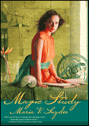
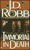
For those of you who don't know I work in the production department of a book publisher. This means I deal with all the many (many, many!) details in the manufacture of books (their physical selves). Printers and paper and scheduling. We also keep track of the profitability of books once the manufacturing costs have been taken into account. For example, an editor may come to us and say, look I have this great book I want to publish and the author wants it to be full-color throughout, but we only want to charge $12. And the sales department says, well we could maybe sell 10,000 copies of a book like that. So I figure out how much that book would cost to print and run a profit & loss statement. This estimates how much profit the book would probably make. Then I tell the editor the bad news that the beautiful color book he wants to create would end up losing the company money. And we try creative suggestions, like how about a regular one-color book with an 8-page color insert? That would make money. Or how about using this cheaper paper? Or a lower page count, or smaller trim size. Or raise the price.
I like to think my job is important (haha!). Obviously the quality of the writing is what ultimately makes a book successful. But the aesthetics of what the book looks like has a pretty large part in bringing it to people's attention. I love gorgeous books (like Eragon above). Quality paper that you want to pet. Nice interior design that's readable and attractive. And maybe most importantly, pretty covers with foil and nice illustrations. Romance readers are forever lamenting the fugly covers so many books get, with good reason. What a book looks like matters a lot--booklovers like to be surrounded by pretty books.
One of the things I enjoyed learning when I first starting working was all the vocabulary of books. (Yes, I am a dork, shut up.) So I decided to share a bit of this with you all. Plus Twin has been trying to teach me to use Photoshop, and this was good practice. If anyone is interested...
A hardcover or casebound book:

Hardcovers have jackets (paperbacks have covers). The case is the hard covering of the book. Cases used to be covered in cloth, and were sometimes called cloth-bound, but cases are almost always just covered in paper nowadays. The papers that are pasted to the inside of the case and run onto the first sheet of the book are the endpapers. Endpapers are usually a solid color. You can see above that Eragon has printed endpapers (special illustrations that go with the book, in this case a map of Alagaesia). Printed endpapers are pretty expensive, so they're only done for books with big print runs. The headband is the little thing that looks like a tiny rope that is glued to the top of the spine. It's completely ornamental, has no function whatsoever.
A trade paperback book:
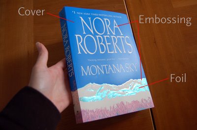
So, like I said, paperbacks have covers. Jackets and covers can have lots of fancy special effects: lamination, embossing, and foil. Lamination is the coating put on the cover/jacket. The lamination can be matte or glossy, and a lot of books are spot gloss, where most of the cover is matte, with some bits glossy. Embossing is when the cover is stamped, so that little bits of the cover bulge out. Debossing is when the cover is stamped so that little bits bulge in (in concave depressions). Foil is, well, obviously it's foil. It's shiny, see. Special effects make covers quite a bit more expensive, so again, the big books get them, and they're sometimes dropped for reprints.

This copy of Montana Sky is what we would call a premium trade paperback. When publishers put out fancy editions of previously published, popular books, and charge more for them. ;) Premium trade paperbacks are bigger and have nicer paper. They often have french flaps on the cover. And the front edge of the text paper isn't trimmed smooth, leaving a rough front. For some reason, rough front looks more classy.
A mass-market book:

Lots of mass-market books (and occasionally a trade paperback) have a glossy first page with an illustration. (In romance, usually with the mullet man and half-naked chick embracing passionately.) This is called a stepback or tip-in. Covers are sometimes die-cut--have bits cut out of them, through which you can see parts of the stepback.
Book interior:
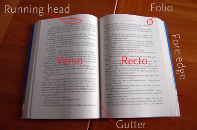
There's lots of vocabulary for parts of the printed page of a book. Right-facing pages are rectos (and are always odd-numbered). Left-facing pages are versos (and are always even-numbered). Running heads are the lines that repeat at the top of each page, usually the author's name on versos and the book title on rectos. Running heads can occasionally appear at the bottom of the page, in which case they're called running feet. The page numbers are called folios. Often on chapter openers, the folio is placed at the bottom of the page and is called a drop folio. If the folio occurs at the bottom of each page throughout the book, it's called a foot folio. The gutter is where the page drops down into the binding. The fore edge is the outer edge of the printed text block, usually trimmed smooth.
So that's most of the basic vocabulary I can think of. This has turned into the Very Long Post. If anyone is still reading, bravo. ;p